PERPÈTE
Perpète started with a clear promise: kids’ clothes that last — truly. The name itself is a playful French nod to durability and childhood slang. The brand took a different path from traditional children’s fashion: practical, bold, colorful pieces, with a strong 80s inspiration and a clear commitment to sustainability.
brand Strategy
Identity
graphic design
Web design
Clothing visual direction
Print
illustration
Photographer | JULIE PERROT
2018 - 2021


The visual identity was developed from the ground up: naming, logo, art direction for the first collections, e-commerce, printed materials. Everything was designed as a cohesive, streamlined system that reflected the brand’s spirit.


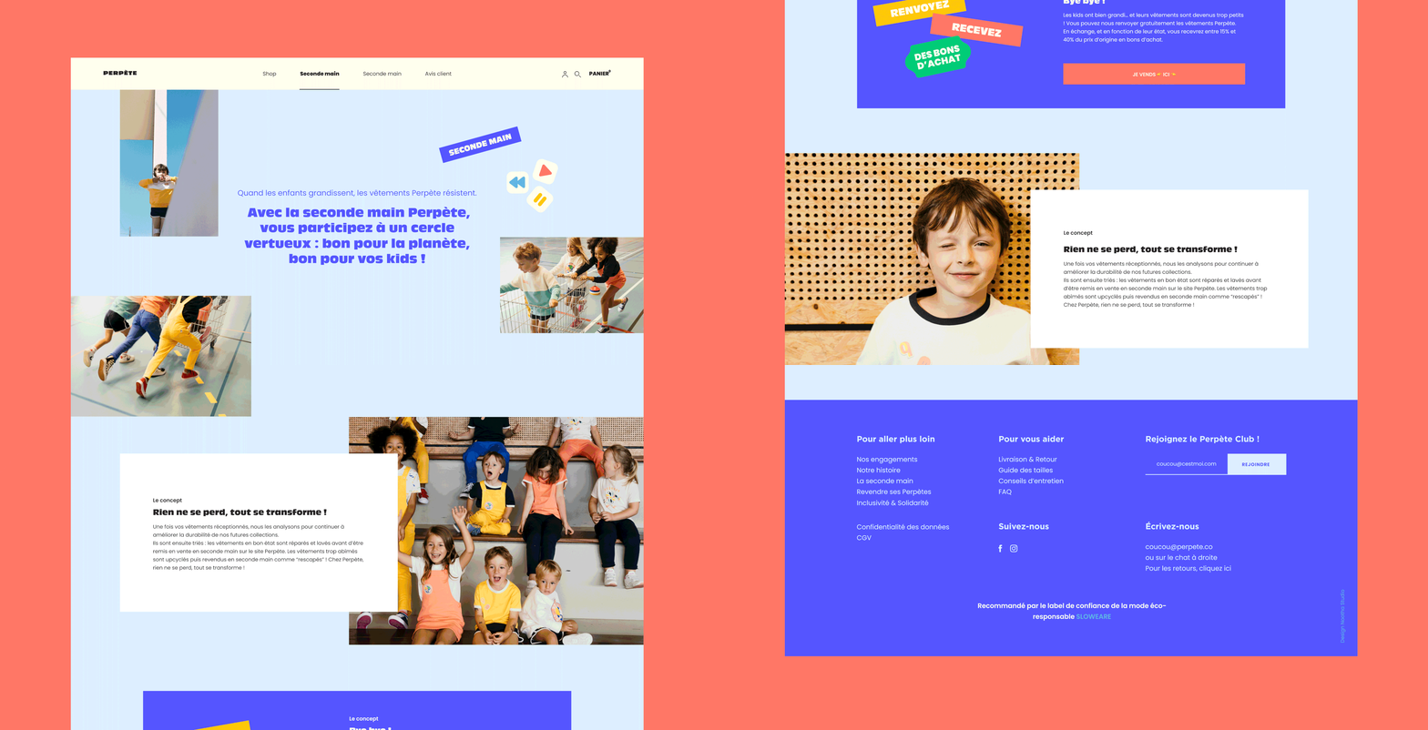
The website was built under tight budget constraints — intentionally simple, modular, and easy to scale. A functional structure, anchored by clear graphic choices, created a strong and distinctive identity without unnecessary layers. This work laid the foundations of Perpète’s early visual world — which has since evolved with a new focus on adult clothing.


For the first collections, I also worked with the founders on developing their brand DNA, thinking about the design of the products and, more concretely, creating the visuals.


